Yqueue:
This was our very first project when we came back after summer in September, it was a three week group project and was suppose to have a tie in or something to do with Wolf Olins, a design and branding agency in New York and London but for some reason that never happened and in fact despite pestering our tutors we are still waiting on feedback from this project! :(
If I remember correctly the brief was to take inspiration from positive aspects of online shopping and invent a service or product which would encourage people to shop on the high street. It was quite a tricky brief as not only did we have to brand and advertise a product we had to invent it too! It was also my first experience of working in a team solidly for three weeks which was... interesting.
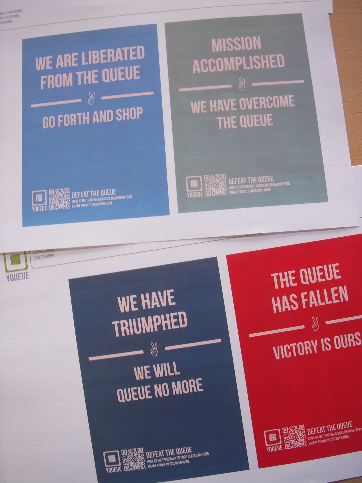
The product we invented was, Yqueue, a service used within shopping centre which cuts out queues and eliminates carrying your shopping bags from shop to shop, allowing you to pick up your purchases at any time convenient to you. Through the use of an app and QR codes items can be scanned and added to a virtual shopping basket, once the customer has finished shopping they can then pay for multiple items from a different shops at a click of a button. A Yqueue employee then collects the customers purchases ready for the customer to collect at a time convenient to them.


The promotion takes inspiration form WWII posters, we wanted to creat a victorious message about our triumph over the queue.
Type and Layout:
The main objective of this brief was teaching us all about typography and layout, it was a 6 week project where every week we'd go to our tutor with our work and he'd give us corrections, we'd change stuff and then the next week we'd go back and he's give us different corrections and suggestions and we'd go away and change stuff... So slowly we refined and refined our work. I spent a long time looking for a typeface for this project and experimented with a lot but eventually settled on Museo which can be found here.


The Open University:
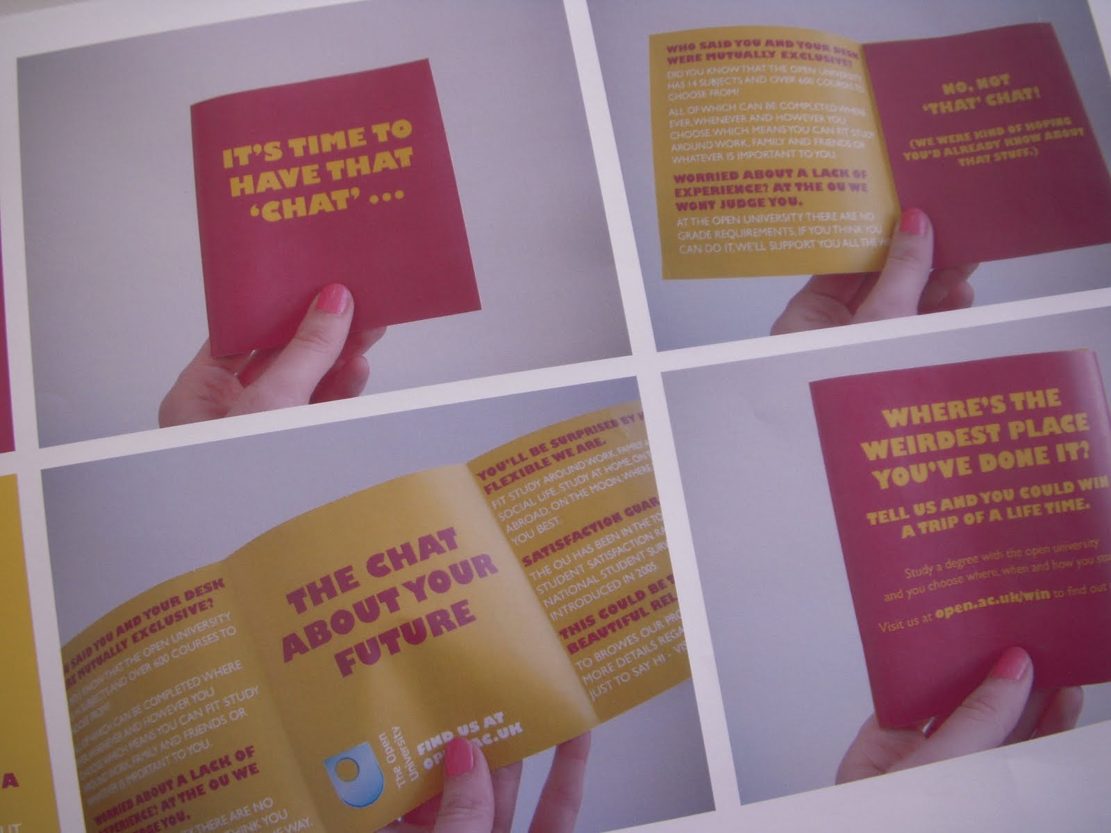
This is my YCN submission, I chose the Open University brief, I'm not sure why, I think it was because all the protests and debates about rising tuition fees was gong on at the time and education was obviously on my brain.
The brief was to encourage 16-18 year olds to study for a degree with the open university, I decided to tackle where, when and how students study and used bold colours and cheeky slogans to attract viewer attention.


Yuck 'n' Yum:
This was my Roses submission, the brief was really open and something along the lines of, "Create and promote an unlikely coalition." My idea was to open a diner which combined different types of foods which would be revolting together but aim it at pregnant woman with crazy cravings. It was a wacky but fun brief, I really enjoyed creating the illustrations, teh typeface I used was Market Deco and can be found here .


