It's not often I watch TV just for the adverts, however on Friday at 10 on channel 4 the new T Mobile ad will be aired for the first time. Filmed at Heathrow T5, passengers were welcomed home by 500 actors disguised as taxi drivers, passengers and cabin crew who suddenly sprung into song and dance. This ad ties in with the other flash mob ads they've done in the past, all promoting the idea that 'Life's for Sharing'.
Thursday 28 October 2010
Wednesday 27 October 2010
Typography and the City
I have been greatly enjoying our classes from Gary Gowans this semester, they are concentrating on typography, layout and grid structures. I have always loved typography, I love the power it provides to create endless styles, different tones of voice and creative expression just from your choice of font. It is an art form, but it is also extremely technical, there is a lot to learn about how to use typography to achieve the best results.
Although I learnt the basics back in College (I received the highest score in the year in the test!) it has been great to recap and refresh my memory. I have particularly enjoyed discovering the importance grids, they have always scared me a little and although I knew they were important I must admit I scarcely ever used them efficiently, if at all.
Our brief from Gary is to go out onto the streets and around town to take as many photos as we could of examples of environmental type, we are then to create a 5 page magazine spread, thinking about composition, white space, grids, choice of typography etc. The magazine is to be classy, think Baseline not a woman's weekly.


Here are a few examples of my photography, I concentrated on old and weather beaten shop fronts and examples of hand painted signage. I find this really interesting and quite beautiful especially as very few still exist. I wanted to keep all my photography black and white to keep with the old fashioned feel of the lettering.


 Here is the first draft of my layout, I am aware things (like my widowed lines of text) still need to be tweaked. I chose two fonts from The League of Moveable Type , League Scrip #1 and Raleway, both are beautiful, thin and elegant. I picked League Scrip #1 as although it's a modern typeface, I feel it's vintage feel and handwritten elegance creates an interesting contrast between the thick and heavy style of the type in the photos. Raleway is much more legible for headings and subheadings yet still compliments the over all feel of the layout. The body copy is in Georgia.
Tuesday 26 October 2010
Is the Most Successful Design Invisible?
When I'm asked by people, 'What do you do?' the question that normally follows, (combined with a slightly puzzled expression) is, 'Oh? And what does a graphic designer do?'. I then proceed by trying to explain the hugely diverse range of work graphic designers 'do'.
Inevitably I end up looking like a lunatic franticly pointing around whatever environment we're in, saying, “Look, this is graphic design! And this, and so is this!” until whoever I'm explaining it to begins to understands or at least pretends to, to get me to shut up, probably wishing they had kept their mouth, and just Googled it when they got home.
I was puzzled myself by the vast variety and different type of work being expected of me when I first started college two years ago: from corporate identity; digital and web design; typography; branding; publication layout; animation; ad campaigns; creative thinking; copy writing. The list goes on. I and found myself uttering, 'But this isn't what a graphic designer does?!' I very quickly learnt that there is much more to being a graphic designer than simply designing business cards and club night flyers. Ultimately a graphic designer's job is to use visual elements to help communicate information, whatever that may be.

There is a great poster I saw a while ago, which reads 'Good Typography is Invisible. Bad Typography is Everywhere.' (I believe it was done by NY agency,Words Are Pictures.) From the moment I saw it I identified with the statement. Now when explaining to someone what graphic design is I always conclude, 'Good design is invisible. Bad design is Everywhere.'
The two short sentences sum up exactly what I’m trying to explain when I go into overdrive pointing at every piece of design in my path. I want them to understand that we are surrounded by design - not only typography, or graphic design but design of all shapes and forms, from service design to product design - it is a discipline that encompasses our lives every single day. Even things like a bus timetable, the washing instructions of their clothes or the road signs they follow to work, they are all are designed yet they are all things we take for granted as just being there. The designer and their decisions simply fade into the background.

The difference between Transport (top) and Curlz (bottom)!
Imagine if all the road signs in the UK were to be changed from the highly thought through and legible typeface - “Transport” - to something cluttered, complex and decorative such as “Curlz”. Then everyone would notice because no one would be able to read the directions, would inevitably get lost and then complain about the design of the road signs being terrible. Conversely though, no one congratulates the designers of the “Transport” typeface at the end of a journey for giving them clear directions to their destination!
This is a topic that really interests me, I think it could be applied to so many cases. For example, Gaps recent logo change (who was talking about Gap before that hideous Helvetica thing was released?!). Their “well designed” previous logo was invisible to people and isolated from their judgement simply because it was always there, serving it’s purpose.

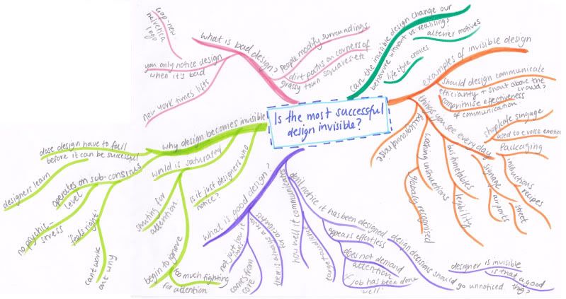
These are all just the very beginning of lots of ideas that I am going to research and look into further for my dissertation. I have created a mind map of my though process so far. Tomorrow we have our first dissertation seminar so I am sure that will give me a clearer idea of what is expected from a dissertation, at the moment I am a little clueless! But it’s a start…
PS. I realise that the picture of the mind map is tiny, I have uploaded it to photo bucket HERE it's still pretty small. However it is too late to sort it out tonight, I'll rescan it tomorrow bigger :) night!
Thursday 7 October 2010


Design Studies: Assignment 1
Corporate Identity and Design
Corporate Identity is the persona of a company or corporation expressed consistently through out their branding and trademarks made up from a variety of different visual elements such as their logo, typeface, colours and slogan. It is a unique visual statement to communicate the ethos, aims and values of the business and to make the corporation clearly distinguishable from their competitors.
A corporation’s corporate identity can be used as a powerful visual symbol of communication, used to demonstrate a clear sense of direction, to build awareness and to strengthen their global brand; it represents how they view their self and how they want to be viewed by others.
It is incredibly important that the corporate identity and values of a corporation must be all embracing, encompassing all that it says and does (Olins 1989). The products it produces, the buildings and factories it trades from to their communication material must honestly represent their aims and values. An important non-visual element to a corporate identity is how the organization behaves towards their staff and customers, as this will have a huge impact on how they are viewed. (Olins 1989)
Gillette and Holiday Inn are two highly recognisable global corporations who understand that an identity must be consistant throughout their brand.
History
The roots of corporate identity can be traced as far back as thousands of years ago from the marks made on the bottom of earth ware pots by potters to distinguish their work from other potters, to religious organisations such as Christianity and Islam who have recognisable visual identities and symbols that have developed and grown over centauries. (Brown 1998)
During the Industrial revolution, identity in the form of trademarks and logos became popular with businesses and factories. The concept of corporate image as we recognise it today was not invented until the twentieth century however there are clear links with today’s corporate identity and the business practice conceived during the industrial revolution. Today the logo serves as one visual element that makes up a corporate identity. (Napoles 1988)
Identity plays a large roll in national symbolism, from the design of bank notes, the colours and imagery in flags to the uniforms of the armed forces all have to be created and designed to show the nation’s ‘persona’, distinguishing them from other nations and to clearly communicate with their people a sense of belonging. (Olins 1989)
During history there has been many examples of nations having their identity changed and their traditions reinvented especially through the use of symbolism and propaganda to help manipulate and sway people. (Olins 1989)
During Napoleon’s rain as French Empire from 1840, he understood extremely well how to use these techniques of manufacturing symbolism and using it to his advantage, creating new government positions, monuments, uniforms and badges, he even commissioned artists to paint propaganda. All of this was used to help sway people, making them aware and helping them to understand what his ‘organization’ was all about.
Many techniques used by Napoleon and other leaders throughout history to create their ‘corporate identity’ are mirrored in modern day corporations. The main issues are still the same, how to motivate people, how to clearly put across your objectives and aims, how to instil a sense of belonging and win people over while getting them to understand the spirit of the corporation. (Olins 1989)
However corporate identity as we know it today was first conceived around sixty years ago as a result of companies beginning to understand the importance of communicating their business values and aims in the growing global market. Globalization increased competition of market-share and as the need for recognition became progressively more intense the importance of a well-designed, efficient and successful corporate identity became essential. (Lubliner 1994)
Design and Corporate Identity
The roll of a designer is incredibly important when creating a corporate identity, in our worldwide market place the design of a corporate identity cannot be left to chance, it is not about simply creating a pretty logo and stationary, designers have to do extensive research and work closely with board members and executives to create an identity that encompasses all the corporation’s main objectives which should then be clearly demonstrated and applied throughout every aspect of it’s design.
The use of symbolism is incredibly important within an identity to successfully create an atmosphere where people feel like they belong, wither it be the colours and slogans used, the values imparted or monuments erected all must emphasise and constantly confirm what the corporation stands for.
Today, in the globalized world we live in identities must be designed to cut across cultures and languages, to be recognizable all over the world and essentially be highly distinguishable from their competitors. If an identity is not coherent and consistent then their key aims and strategies will not be met. (Lubliner 1994)
Things that a designer should constantly think about when designing an identity are ‘who is the company?|’ and ‘what does it do?’ (Lubliner 1994)
In the early 1980s Aston University in Birmingham was run down and was perceived as a second rate university. It lacked a coherent identity; it did not have a clear sense of values or aims, which was contributing to low staff moral and poor student grades. However a new Vice-Chancellor wanted to change the image of the university and hired corporate identity consultants who through research identified the main problems. They went on to design Aston University a corporate identity which included, a new logo which was applied to everything, landscaping the grounds, campus building work, signage and other graphic materials so that the university’s aims and values could be clearly expressed and it’s persona could become apparent.
Ultimately they created a new image and vision of the university, which has continued to expand and grow; now making Aston one of the leading universities in the country for information technology. (olins 1989)
This is a brilliant example of how good, well researched and considered design of a corporate identity can help an organization achieve it’s goals, strengthen it’s name and improve it’s credibility to the wider world. Proving that a well designed corporate identity is linked with business success, and demonstrates why corporations embrace the power and influence of symbolism that a corporate identity can provide.
Bibliography
Author Unknown . (2008). Graphic Design Dictionary. Available: http://newyorkgraphicdesign.info/graphic-design-dictionary.html. Last accessed 6th Oct 2010.
Author Unknown . (Unknown). Audio Branding Academy: Glossary.Available: http://audio-branding-academy.org/abaweb_en/abaweb/?page_id=24. Last accessed 6th Oct 2010.
Brown, Jared & A. Miller, (1998). What Logos Do and How They Do It. pp. 6-7.
Lubliner, M. J (1994) Global Corporate Identity, the Cross Border Marketing Challenge. Rockport Publishers, Inc. ISBN: 1-56496-110-9
Napoles, V (1988) Corporate identity design. John Wiley & Sons. ISBN:0-471-28947-7
Olins, W (1989). Corporate Identity, Making business Strategy Visible Through Design. Thames and Hudson. ISBN:0-500-01472-8
Subscribe to:
Posts (Atom)