Title
How important is environmental type in shaping perceptions and altering the way people interact with their surroundings? And how can environmental typography be used to modify behavior, opinions and alter user experiences within an environment?
Summary
I have always had an interest in the design that surrounds us every day that we rely on to function but is often over looked or ignored, a good example of such design is environmental typography. Typography is an integral part of our lives it is a necessity that we rely on to function, it surrounds us everywhere we go, within signage, billboards, graffiti, posters and corporate identity. But what impact does it have on shaping our perceptions and judgments towards that environment, organisation or government? And can a place be defined and identified by the typography within it? Can type be used as a medium to express a place’s unique culture, values and style, to help enrich the quality of life and our visual environment? Or is the array of type that we are bombarded with desensitising us to our surroundings, visually polluting our cities and towns?
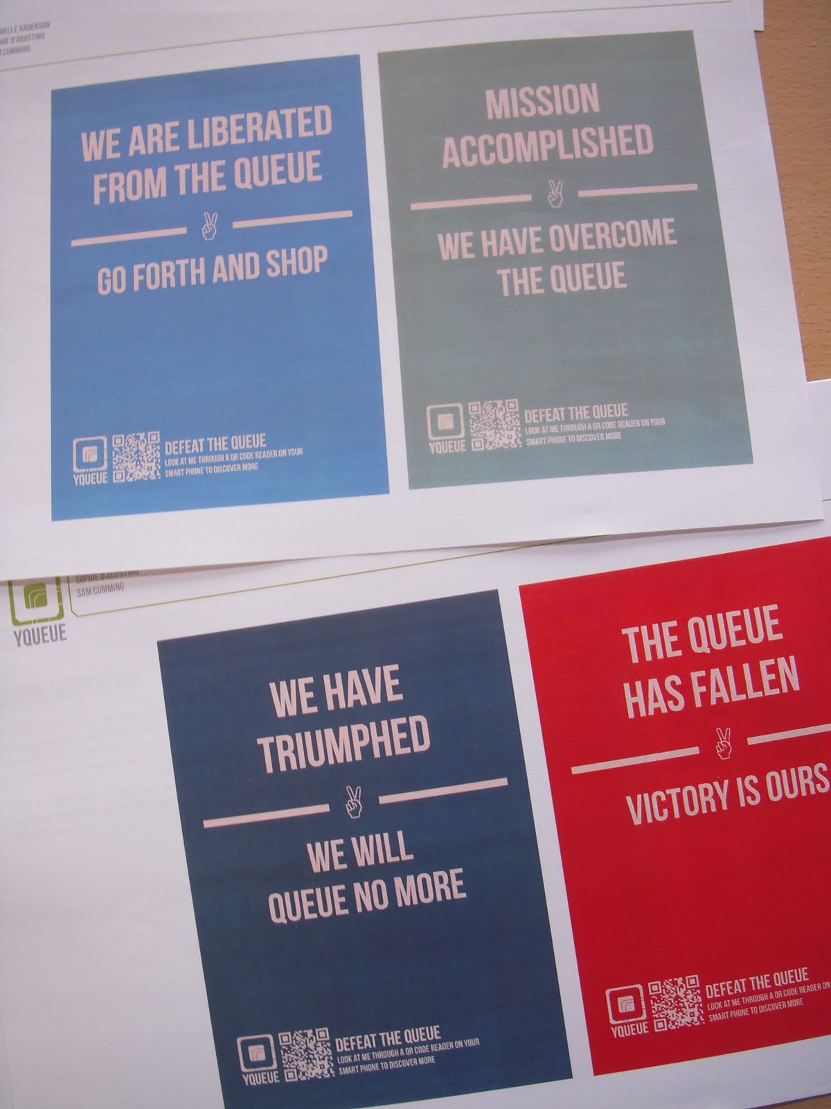
There are many different ways type can be used within an environment, each have a specific job to perform, although the main function, whatever its message is to communicate effectively and clearly. There are many technical aspects when designing with type, such as colour, composition; it’s location and typography choice. The tone of voice, or visual language is also an important aspect when trying to convey feelings or opinions though typography. Type can indicate attitudes and changes within a society or reflect the ideologies of the organization or government, for example a sign, which greets a traveller at an airport, might say, “You can trust me” “I am modern” or “You will be robbed” all through it’s visual appearance, without stating those actual words.
Along with people, sounds and smells, typography acts as essential component within an environment; helping to give a place it’s visual voice and identity. It provides a means of communication and has the power to produce an emotional response or influence the way an environment functions. By varying how type is used within an environment will alter the impact on the environment and in the way people interact within that environment. I wish to gain a better understanding if there is a difference in impact and influence of an environment based on it’s planed or authorised typography such as signage and advertisement billboards compared to unauthorised type such as graffiti and illegal posters? And when we rely on type so much to gain an understanding of our complex environments what are the consequences when it fails to help us?
Aims
I wish to carry out this research with the aim of having a greater understanding of the role typography plays in how we interact with our surroundings, and how we form judgments (subliminal or consciously) towards that environment, government or organization. I believe by having a good knowledge of this we can begin to understand how to design typography for specific areas, which will help modify behavior, opinions and improve user experiences within that environment.
Objectives
I wish to produce a comprehensive study into my chosen subject, I will do this by using relevant secondary resources such as books, academic articles and web sources but more importantly by carrying out my own primary research. This will involve organizing focus groups to determine first hand the impact typography has. I will do at least two different sessions with different demographics such as designers compared to non-designers to gain a broader understanding of how this topic affects different types of people. I will carry out surveys and questionnaires also looking at public reactions and attitudes to typography within the environment.
Keywords
Environment, typography, sign design, signage, user, exposure, perception, lettering, communication, interaction, function, visual language, values, surroundings, behaviour, legibility, public, efficiency, message.
Bibliography
Baines, P, Dixon, C. 2003 Signs, Lettering in the Environment, Laurence King Publishers.
The main purpose of Baines and Dixon’s book is to discuss the function and execution of the signage we encounter in our environment every day. They look at examples of signage, both contemporary and historical and explain how these pieces of design work we take for granted help shape our lives.
Bartram, Alan. 1975. Lettering in Architecture. Lund Humphrise Publishers Limited
Shows how lettering has been used traditionally in architecture. Bartram explains the differences in letterforms and materials used, and looks at how type and buildings contribute to each other’s success. Bartram discusses the importance of the visual language of each period of architectural lettering, looking at how character, quality and flavor all add to the environment.
Billings, S, 2008, ‘Paths to Safety’, Design Week, vol. 23, no. 32, pp. 16-17, 7 Aug 2008
The article focuses on the need of signage systems in public places in regulating the flow of people and minimizing the risks of accidents and loss. It states that designing public places will make people safer and may decrease the tension in the environment.
Bonnici, P.1999 Visual Language, The Hidden Meaning of Communication, Roto Vision SA.
The main purpose of Bonnici’s book is to provide an understanding of the Visual Language within communication, looking at how the appearance and feel of an item of design can communicate independently of the descriptive content of text and images. Bonnici addresses how elements of visual language, such as colour, type, shape, proportion, texture and imagery be used to create a powerful hidden medium of non verbal communication within an item of design to provide work that communicates more effectively
Burgoyne, P, 2005, ‘Clearly Better’ Creative Review, January, 46-50
In this article, Patrick Burgoyne introduces us to the new typeface that will be used for American road signs. Talks about redesigning the typography for the elderly population who due to ‘halation’, a glowing effect that causes the words to appear filled in which was causing accidents. Shows us sketches of the process from the original to the new designs helps us understand the value simple changes to the counters and x height and how those changes can make the typeface more suitable and readable for the general public. The basic idea to this article is that the small things make big differences.
Butler, J, Lidwell, W, Holden, K 2003 Universal Principles of Design, Rockport, USA
Provides a reference for design concepts. Useful for me, exposure effect, the repeated exposure to stimuli for which people have neutral feelings will increase the likeability of the stimuli. Legibility, the visual clarity of text, generally based on size, typeface, contrast and spacing of the characters used, picture superiority effect, pictures are remembered better than words. Wayfinding, the process of using spatial and environmental information to navigate to a destination.
Castella. T. 2010. Do typefaces really matter?. Available: http://www.bbc.co.uk/news/magazine-10689931. Last accessed 15th March 2011.
Explores the impact a typeface can have on how a service, product or organisation is perceived. Gives example of how the typeface used in film Avatar caused outrage among type fans. Looks into how a typeface can convey different messages.
Crosby, T, Fletcher, A, Forbes, C, 1970, A Sign Systems Manual, Littlehampton Book Services Ltd, USA
Illustrates and describes a simple basic system for designing, contracting and displaying signs. It also dives into the history of alphabets and the development of type.
Dowdy, C, 2002 ‘Direct Methods’, Design Week, vol. 17, no. 36, pp. 22-25
This journal discusses the improvements being made to the signage on London’s South Bank. Dowdy believes in everything getting simplified down, and cleaned up to improve our London streets and if we don’t cut down, ‘Graphic Nosie’ will begin to take over the streets and it will become evermore frustrating to find your way around and use sign posts properly. The author is trying to make it clearly that we need to clean up our streets in order for them to feel safer, calming and more in touch with where you are.
Editors Of Signs of the Times Magazine 1997, Sign Gallery. ST Publications.
Looks at recent technical innovations and advances over the past few years and gives examples of how sign designers are taking advantage of the new technologies, in their designs.
Editors of Signs of the Times Magazine 1986, Sign Design, Contemporary Graphic Identity, ST Publications.
This book demonstrates the possibilities that can be achieved through sign design and highlights the quality and skill of an industry whose work often get ignored or overlooked. It looks at different categories of sign design, including, retail, professional services, corporate identification, real estate and experimental work.
Gibson, D. 2009, The Wayfinding Handbook, Information Design for Public Places, Princeton Architectural Press.
This book covers sign design and wayfinding as a whole, covering everything connected to the discipline. It includes a brief history on sign design and covers different aspects of typography including legibility, size, arrangement and line spacing.
Graham, L. 2002 Basics of Design, Layout and typography for beginners, Delmar Thomson learning, Canada
This book provides information on basic design principles for designing with type covering areas such as emphasis, technical terms and elements such as colour and alignment.
Hunt, W, Laberccque, E, Rosentswieg, G. 1994, Designing and Planning Environmental Graphics, Madison Square Press
This book provides practical information from environmental graphic designer’s, they give individual case studies and detailed annotation and documentation on real projects. This gives a good insight into the design process, including technical information and specific information.
Knapp, Stephen. 1995, Sign Design Gallery 2, Rockport Publishing
Explores the effect of ‘digital revolution’ on sign design, this book serves as a tribute to all designers who keep alive the craft of sign design. The fain focus of this book is on computer aided sign design. Covers, ground signs, projection signs, sing systems, wall mounted signs and specialty signs.
Kress, K and Leeuwen, T, 1996, Reading Images The Grammar of Visual Design. St Edmundsbury Press Limited. Great Britain
Kress and van Leeunwen examine the ways in which images communicate meaning. Looking at the formal elements and structure of design: colour, perspective, framing and composition. The authors demonstrate both the differences and the similarities between the grammar of language and that of the visual communication.
McClendon, C, 1982 Signage: Graphic Communication in the Built World, McGraw-Hill Inc.,US; First Edition
Schwartzman, A. 1998, Designage, The Art of Decretive Sign, Chronical Books.
This book provides an overview of a universal means of communication, through photography it captures and celebrates the artistry and imagination of sign design throughout the years.
Shmidt, K. 1996, Signs of the Times, Graphis U.S. INC.
This book includes a large collection of photographs of environmental typography from the last fifty years showing an overview of the type of signage we over look and take for granted every day. The author also provides a short history and introduction that is insightful.
Trulove Grayson, J. 2000, This Way, Signage Design for Public Spaces, Rockport Publishers.
Shows how new and traditional materials are being used together to create new vibrant signage designs. The book gives a behind the scenes look at real signage projects and explains the philosophy behind each.
Sims, M. Sign Design, 1991, Graphics, Materials, Techniques, Thames and Hudson LTD.
This book highlights the value gained by designers who understand the importance of sign design; this book acts as guide, covering process, materials and techniques along with other important information for designers to take into consideration such as cultural and aesthetic factors.
Vartanian, I, 2004 Graphiscape: New York City, Rotovision
This book covers Graffiti, posters, neon lighting, street art, colour schemes, perspectives and forms. The book is organized around structure, communication, problem solving and originality - all problems that drive design itself. Design is site specific; the flavour of the city is tasted through the vast variety of its visual elements that can be called graphic design in its widest sense.


 Link
Link